Reddit puts an edit of a gray New York Jets uniform into the world
We’re in the third year of the new New York Jets uniform set that was unveiled prior to the 2019 season, but the team’s garb has seemed to be a bigger topic this season than usual.
Team owner Woody Johnson can be thanked for that, as Johnson has become infamous for seemingly allowing fans on Twitter to influence the team’s uniform decisions.
For instance, ahead of the Jets’ Week 7 trip to New England, Johnson backed out of his announcement that the Jets would wear a white-on-green look after fans pestered him in the reply section with vitriol for the much-despised green pants. He ensuingly announced that the Jets would instead wear white-on-white, as requested by the majority of fans.
The white-on-green look has not been seen since the Jets started the year with an 0-2 record in the set.
When the Jets headed to Indianapolis for a prime-time showdown in Week 9, Johnson announced the Jets would debut an all-new look featuring white jerseys and black pants, which was a popular suggestion from fans throughout the week.
So, uniform chatter has been all the rage amidst another lost Jets season in which fans have been yet again forced to scramble for things to talk about.
Reddit user u/jetssean added to the uniform hullabaloo with mock-ups of Zach Wilson in a gray uniform – mimicking the alternate jersey sold by the Jets.
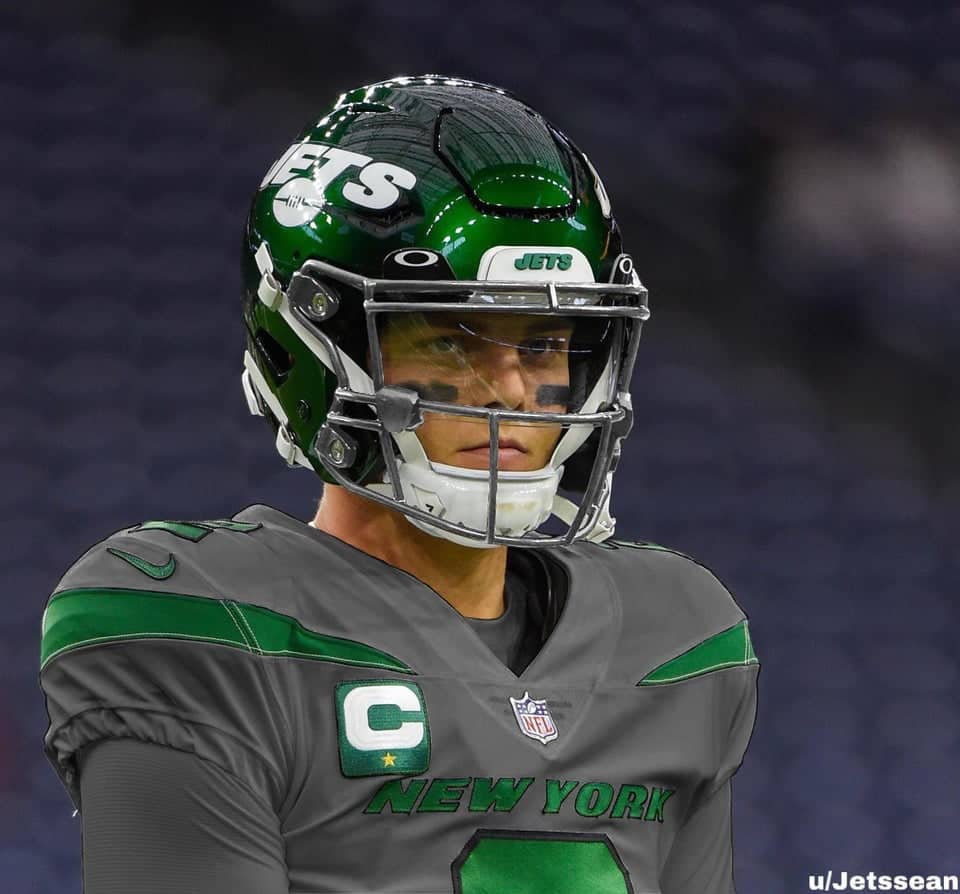
To better match the jerseys, the edit also changes the Jets’ black facemasks to silver.
I like what’s going on here. The gray/silver color scheme does give off “jet” vibes. It reminds me of the sleekness of an actual plane.
The gray here is a little dark, though. Perhaps a lighter gray would get the job done?
Play: 👉 the Jet X Offseason Simulator
New York has not adorned the color gray in any capacity since donning throwback uniforms in a 2018 game against the Colts that swapped out the team’s typical green facemasks for gray facemasks, paying homage to the Super Bowl III-winning squad that wore gray facemasks.