Despite the low ranking, the Jets weren’t the worst in the AFC East
Endeavors that scrape the bottom of the NFL barrel are, alas, nothing new ever since the New York Jets introduced a new “Gotham Green” aesthetic in 2019.
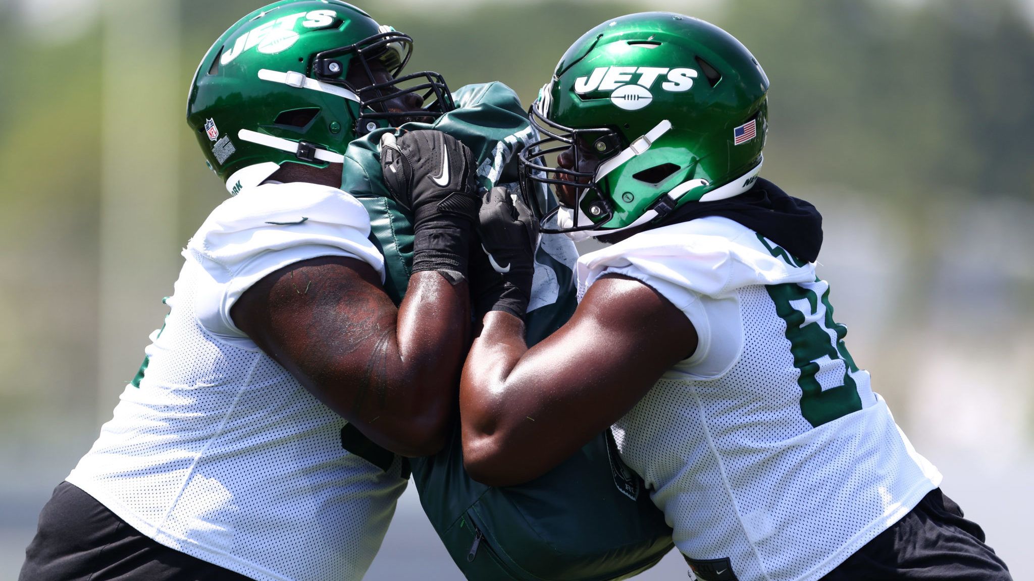
USA Today’s For the Win website was the latest to pile on with its ranking of the NFL’s 32 helmet designs. The list topped by the timeless half-logo look of the Pittsburgh Steelers. The Jets, on the other hand, ranked 29th, besting only Denver, New England, and Tennessee.
List curator Christian D’Andrea acknowledges the Jets’ good intentions with the team’s current helmet, a glossy emerald look that resembles their headwear from the 1980s. The relatively minimalist logo sticker, on the other hand, seems to be torn away from the oval logo that has repped the Jets throughout their history and received a slight update upon the 2019 makeover.
D’Andrea, however, declares that trying to please every generation leads only to aesthetic disaster.
“The Jets’ new helmets attempt to straddle the line between their past and the design that replaced it through the 80s and 90s,” he writes. “The result is a compromise that pleases no one. Yep, they’re the Jets all right.”
The Jets’ modern look has received a mixed response amongst the fanbase. Many have expressed a desire to see their prior design return (the ones worn from 1998 through 2018 and served as an updated take on the 1960s-style uniforms). Fans also expected a green helmet to yield a 1980s-style throwback, which could have been one of the few “accurate” visits to the past based on the NFL’s one-shell rule. While that rule has been rescinded (with the New England Patriots among those taking advantage), team owner Woody Johnson has hinted at a desire to see the 80s return, complete with the “speedbird” logo sticker.
The Los Angeles Chargers and New Orleans Saints sit behind the Steelers in the top spots of For the Win‘s list, while Atlanta and Dallas round out the top five. Buffalo’s white-emblemed helmets are the highest-ranked AFC East cap at No. 14, and Miami came in at No. 25.
Geoff Magliocchetti is on Twitter @GeoffJMags